Think happy, be happy.
A name that sounds like excitement.
YooHoo began with one goal: to be the #1 home for power-packed, action-filled, emotion-inducing TV shows and film series. “YooHoo!” is the sound of excitement, happiness and hope, and the sound of families having the best time ever.
The job was to make a brand that sounds and looks like that, then carry it into a product people could get into from any phone.
01Another evening of scrolling, and nothing worth watching.
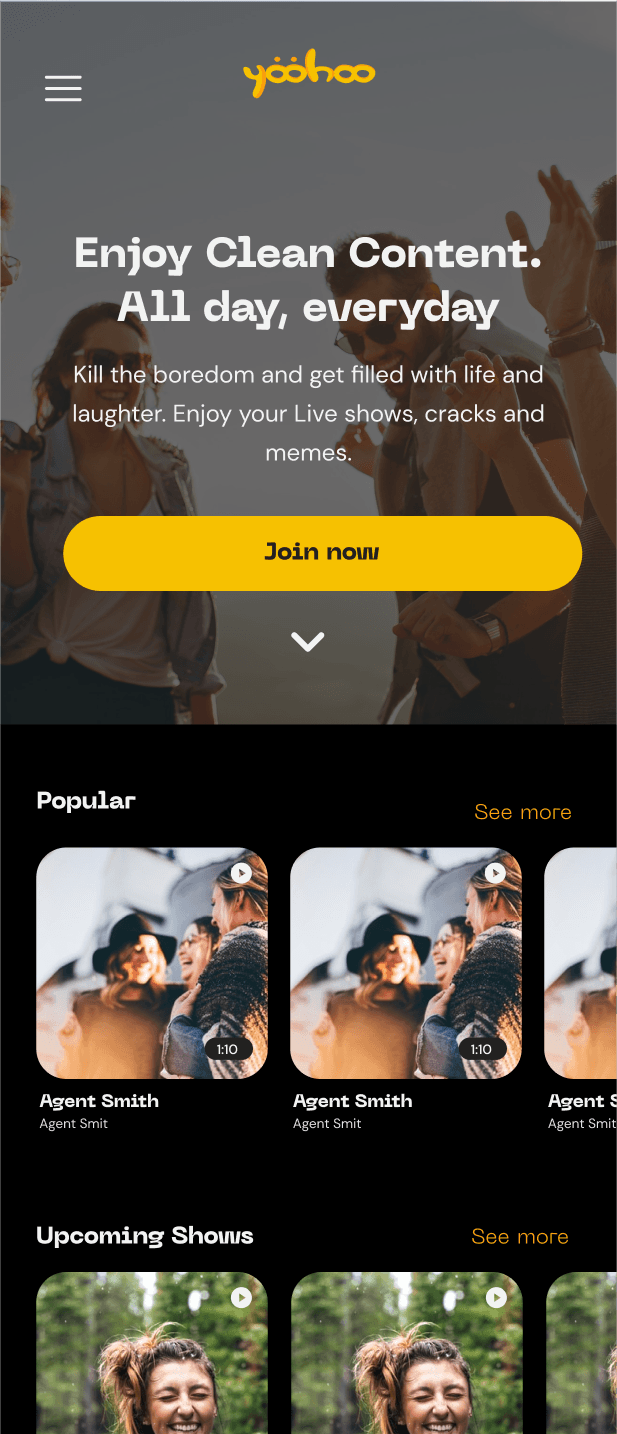
02YooHoo opens on her phone: “Enjoy clean content. All day, everyday.”
03One tap on Join now. The site was designed for phones first, so getting in is easy.
04Trending, Popular on YooHoo, Comedy: a row for every mood.
05Live shows, cracks and memes: the boredom’s gone.
06And the best nights are shared: “the sound of families having the best time ever.”
Illustrative, drawn for this case study from the brand story and screens described here.
- Brand discovery: the mind map of feelings the brand had to carry
- Identity: logo, tagline, colour, type and photography treatment
- Brand in use: app icons and merchandise mockups
- Mobile-first website, from landing page to sign-up
- Web app: Home, Discover and the browsing experience
- 01 · DiscoverBrand feelings
- 02 · BrandIdentity
- 03 · ApplyIn use
- 04 · DesignWebsite & app
- 05 · NextBeta & testing
Four feelings, one name.
Before any logo, I mapped what “YooHoo” should make people feel. Four branches came out of it, each with the words that keep the brand honest.
Rebuilt from the original mind map.
What shaped the brand.
YooHoo sells a feeling, not a catalogue.
The name is “the sound of excitement, happiness and hope”.
Watching is better together.
Friendship is a whole branch of the map, and the story ends on families having the best time.
Getting in has to be easy for everyone.
The aim was ease of use and democratised entry points.
Warm, friendly and easy to get into.
1A logo that is two happy friends
Evidence · Insight 02A plain wordmark, or a mark that carries the brand’s meaning on its own.
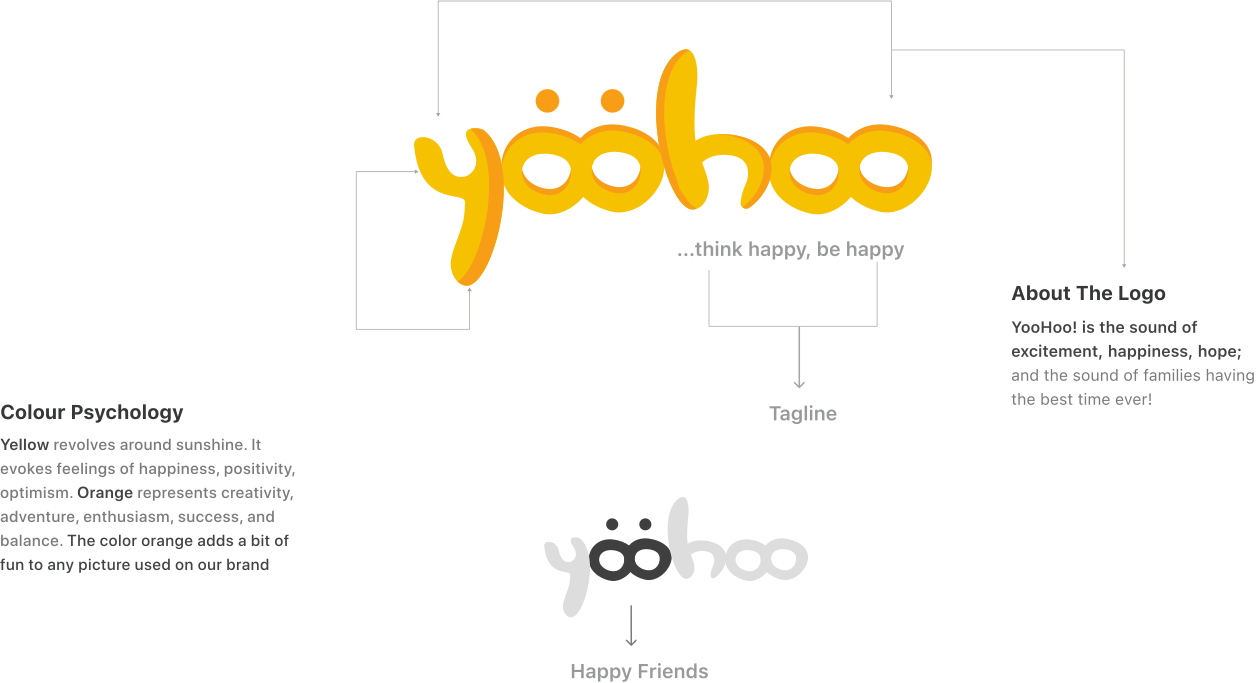
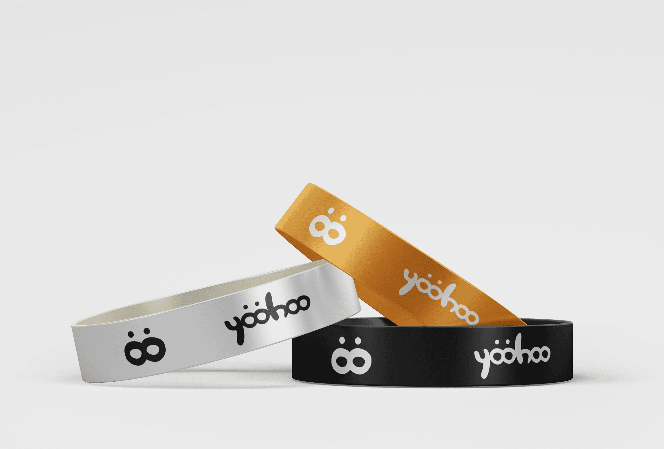
The two o’s double as two smiling faces, “Happy Friends”, with the tagline “…think happy, be happy”.
Friendship and happiness sit at the heart of the mind map, and the faces work alone as an app icon.
A playful mark sets a light tone, so the action and drama in the catalogue have to come through in the imagery.
2Yellow and orange, laid over photography
Evidence · Insight 01A neutral, content-first palette, or colour that does the emotional work.
Yellow for happiness, positivity and optimism; orange for creativity, adventure and enthusiasm, used as tints over photos.
Orange adds a bit of fun to any picture used on the brand, so even stock imagery feels like YooHoo.
Strong tints need care so faces and posters still read.
3Mobile first, with Join now up front
Evidence · Insight 03Design the desktop site and shrink it, or start from the phone.
The website was designed mobile first: headline, one line of copy and a Join now button, then Popular below.
To allow ease of use and democratise entry points.
The richer browsing layouts moved into the web app instead of the website.
Our logo is our flag.
It represents who YooHoo is and what it stands for: a symbol of identity, and of trust in the process.
- Yellow#F6C101
- Orange#F79E16
- Black#000000
- White#FFFFFF
The colour orange adds a bit of fun to any picture used on the brand.



Clarity and hierarchy come first in the brand’s communication. Neue Machina and DM Sans are the brand fonts.

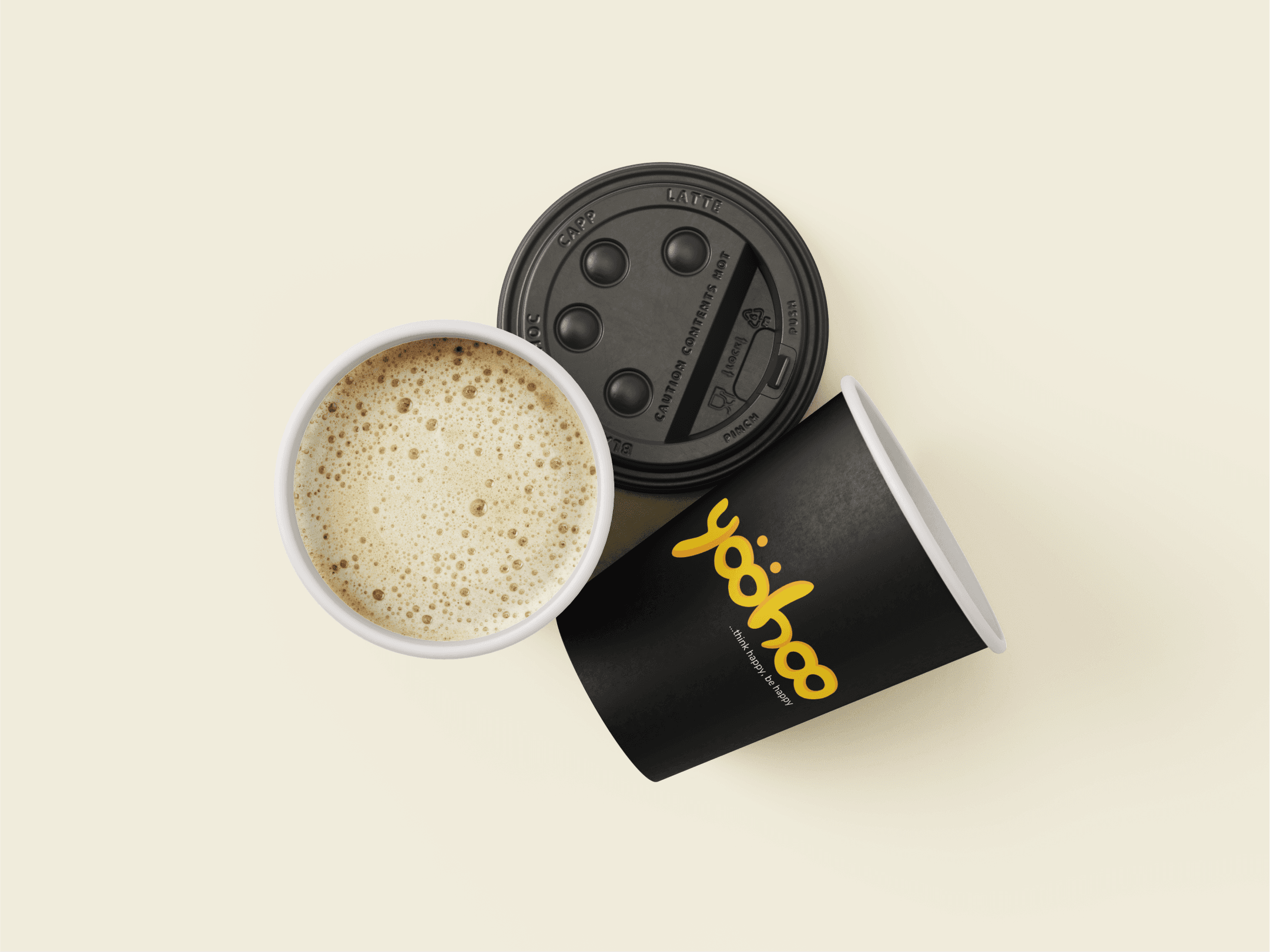
To allow ease of use and democratise entry points, the website was designed mobile first.
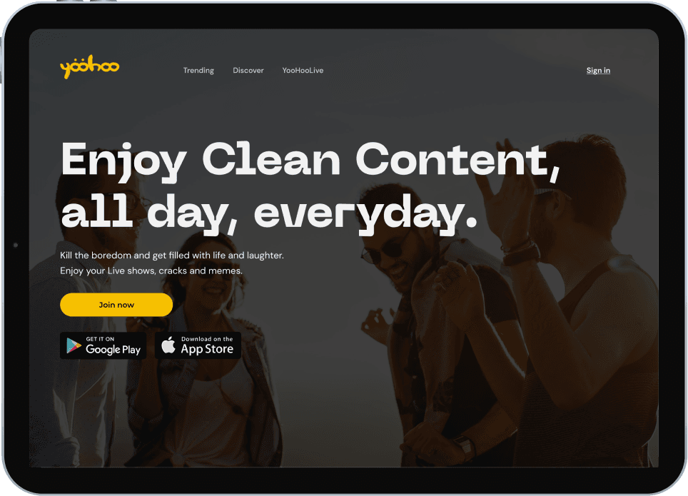
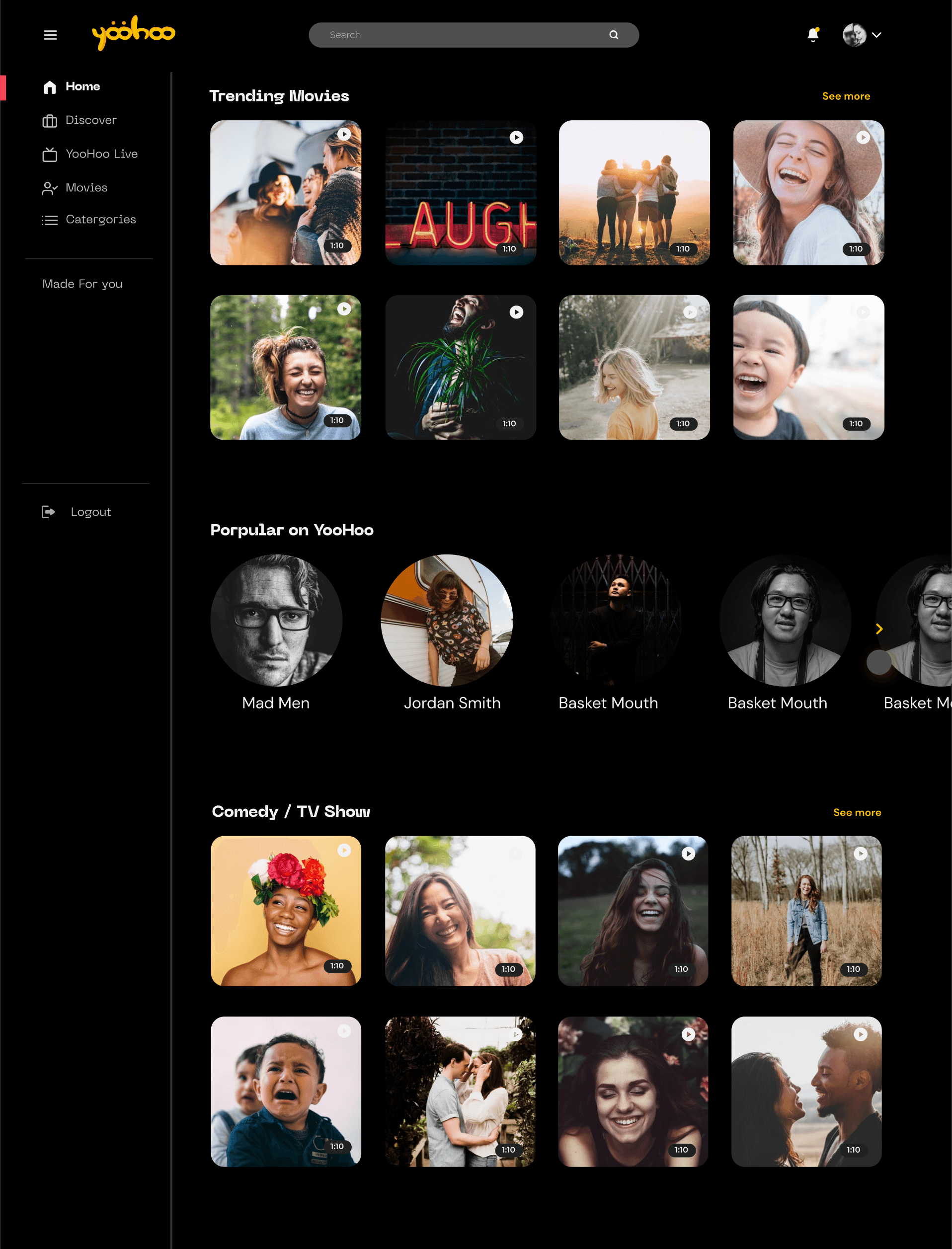

Ready for beta.
- Insight 03Landing to sign-upConversion rate: visitors who tap Join now and finish signing up, on mobile and desktop.
- Insight 03Time to first playTime on task: from sign-up to the first show started.
- Insight 01Coming back for moreRetention rate: viewers who watch again within a week.
- Insight 02Watching togetherShare of sessions on shared screens, or shows shared with friends.
- Insight 01Does it feel like YooHoo?Desirability test: do people pick “exciting”, “happy”, “playful”, “friendly” to describe it?
- Insight 02Brand recallFive-second test: can people recall the name and the two-friends mark?
A full-range stretch.
- One of my most stimulating projects. This is by far one of the most interesting and mentally stimulating projects I’ve worked on.
- Brand and product, end to end. It helped me develop my capacity as a full-range professional.
- What came next. The next step was beta development and rounds of testing, but I’m no longer involved with this project.